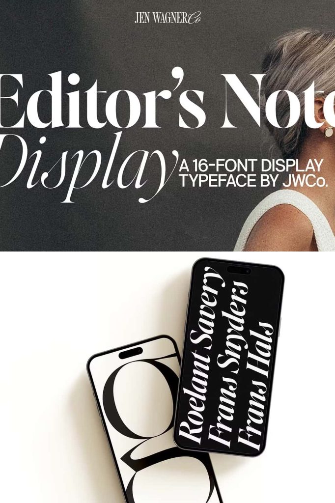
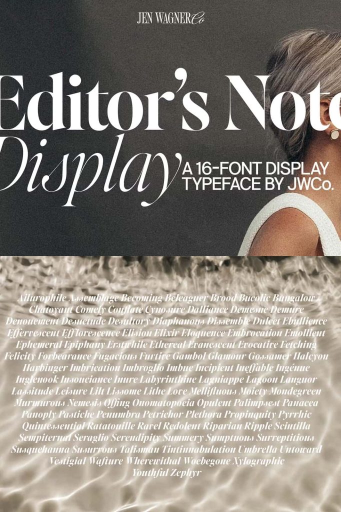
Editor’s Note Display Font
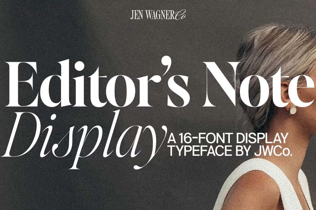
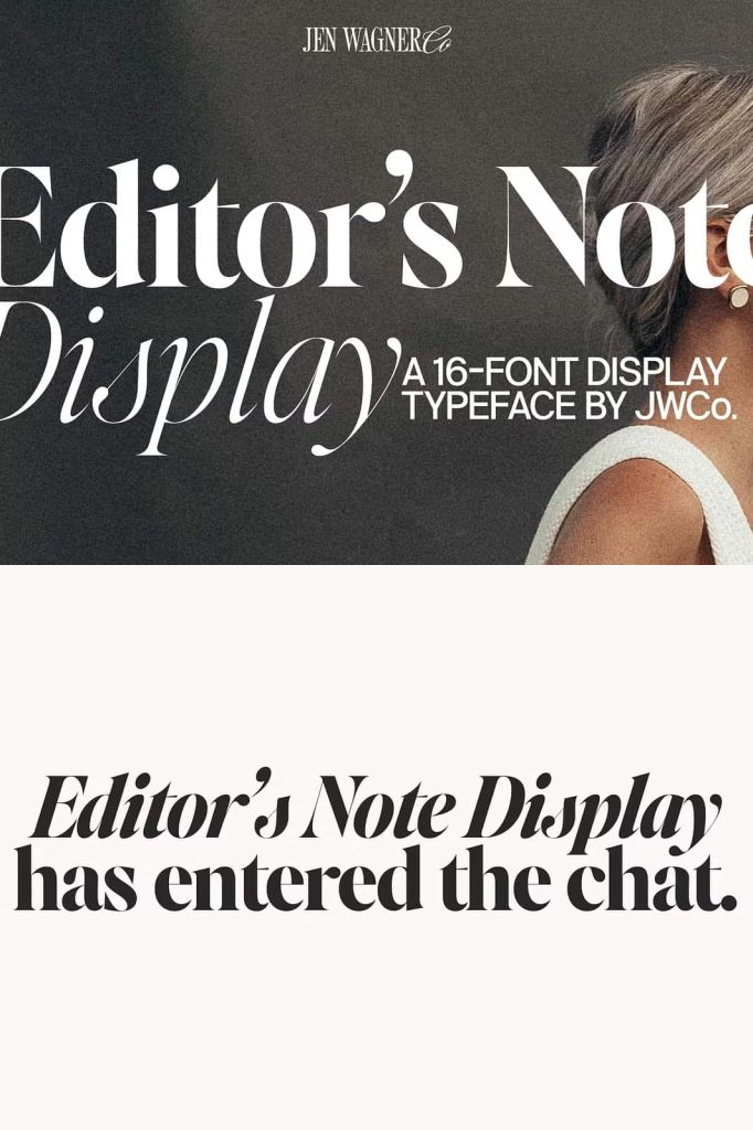
Editor’s Note Display is a striking high-contrast serif font designed to deliver bold visual impact and refined elegance. As the display companion to the Editor’s Note type family, this font enhances the core letterforms with sharper details, stronger contrast, and dramatic thin strokes that stand out beautifully in large typography.
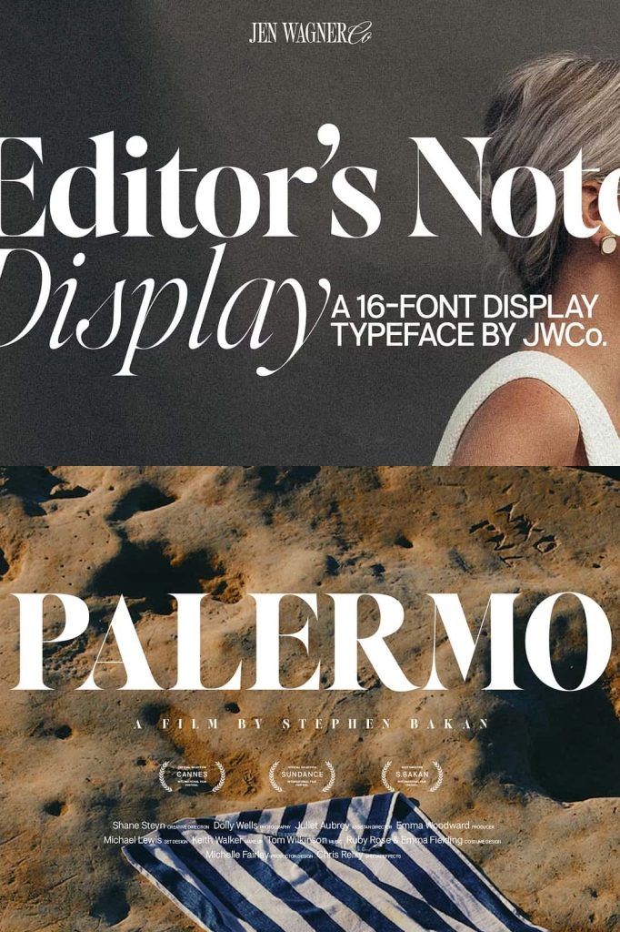
Designers created Editor’s Note Display to shine in attention-grabbing applications such as headlines, magazine titles, posters, and branding elements. The font preserves the recognizable structure of the Editor’s Note family while introducing a more dramatic and expressive personality. With its crisp edges and carefully refined lines, this typeface transforms simple text into visually compelling typography.
Every element of the font reflects careful design decisions. Each curve, point, and stroke contributes to a polished and balanced typographic system that performs beautifully in display settings. When used at large sizes, Editor’s Note Display reveals its full character, delivering an elegant and powerful visual presence.
High Contrast Serif Design
One of the defining characteristics of Editor’s Note Display is its high contrast between thick and thin strokes. This design approach creates dramatic visual tension that captures attention immediately. The thick strokes provide structure and stability, while the ultra-thin lines introduce delicate elegance.
This contrast gives the font a sophisticated editorial personality often seen in fashion magazines, luxury branding, and premium publications. Designers can use this typeface to create strong visual hierarchy while maintaining a refined and stylish appearance.
The sharp transitions between strokes add depth and visual interest to each letterform. When placed in headlines or large typographic compositions, the contrast becomes even more striking, making the text feel dynamic and sophisticated.
Razor-Sharp Details
Editor’s Note Display features precisely crafted points and edges that add clarity and character to the design. The sharp terminals and delicate lines create a sense of precision and craftsmanship that elevates the entire typeface.
These details make the font particularly effective in display typography, where viewers can appreciate the subtle design features at larger scales. The crispness of the letterforms helps ensure that the font remains visually clean and elegant even in large-format designs.
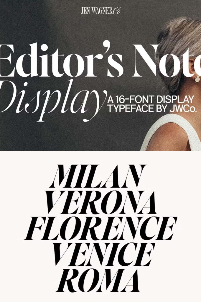
Designed for Large Display Typography
Editor’s Note Display performs best when used at larger sizes. Designers specifically engineered the font to excel in headlines and display settings where its dramatic contrast and sharp features become more visible.
The typeface maintains perfect balance even when scaled significantly. Each curve and line has been carefully refined to ensure that the design never appears distorted or uneven at large sizes. This meticulous attention to detail allows designers to confidently use the font in posters, editorial spreads, and brand identities.
Because the letterforms retain clarity and structure at large sizes, Editor’s Note Display offers exceptional visual impact while preserving readability. The result is typography that commands attention while remaining sophisticated and polished.
A Refined Extension of the Editor’s Note Typeface Family
Editor’s Note Display acts as the high-impact partner to the Editor’s Note and Editor’s Note Text fonts. While those versions focus on readability and versatility in body text, the Display version emphasizes visual drama and expressive typography.
The font retains the core structure of the original Editor’s Note design while introducing sharper contrast and more dramatic stroke variations. This relationship allows designers to create cohesive typographic systems that combine multiple styles from the same family.
For example, designers can use Editor’s Note Text for paragraphs, Editor’s Note for subheadings, and Editor’s Note Display for main titles. This layered approach builds strong visual hierarchy while maintaining consistent design language across the entire layout.
Consistency Across Typography Systems
Because Editor’s Note Display shares the same design foundation as the rest of the Editor’s Note family, it integrates seamlessly into editorial and branding systems. Designers can combine different styles within the family to create visually balanced compositions that feel unified and professional.
This flexibility makes the font particularly valuable for large projects such as magazines, digital publications, and brand identity systems.
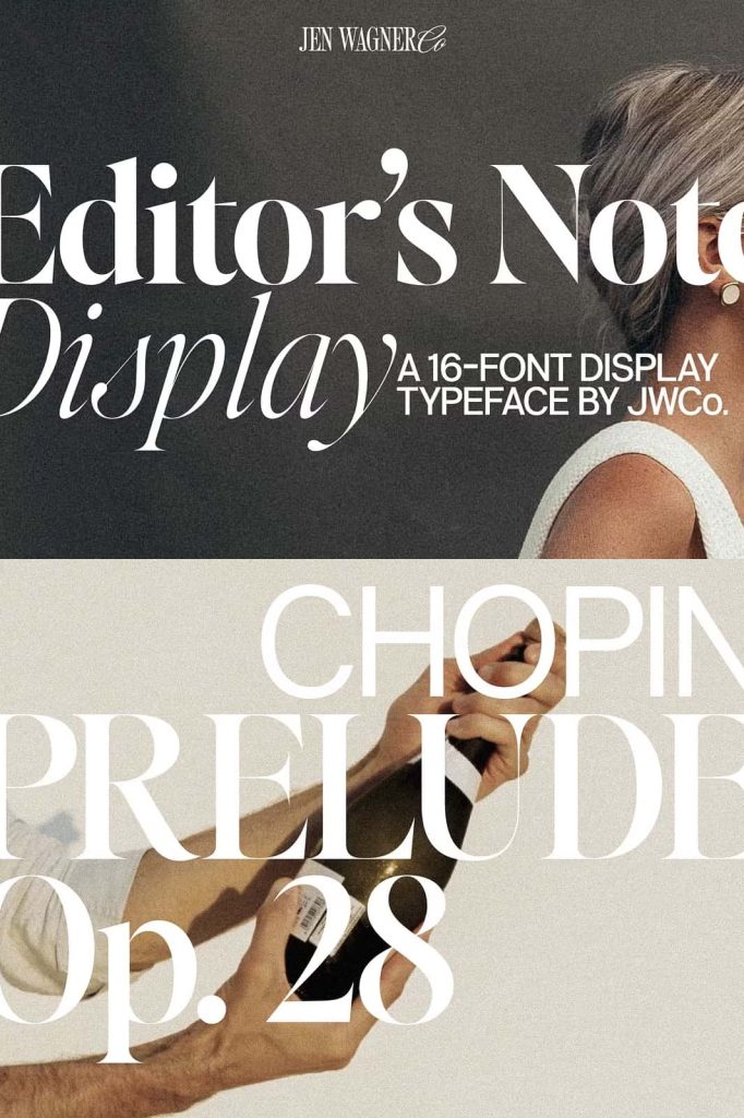
Perfect for Editorial and Luxury Design
Editor’s Note Display works exceptionally well in environments where elegance and sophistication play a central role. The high contrast and refined structure give the font a premium appearance that fits naturally within editorial and luxury design contexts.
Designers frequently use this typeface in projects that require bold headlines and strong visual identity. The dramatic contrast and crisp details help the typography stand out while maintaining a polished and professional feel.
Common design applications include:
- Magazine headlines and editorial layouts
- Luxury branding and fashion campaigns
- Poster and advertising typography
- Website hero titles and headers
- Book covers and publishing design
- Event branding and promotional materials
- Elegant packaging design
In each of these contexts, Editor’s Note Display brings sophistication and visual authority to the design.
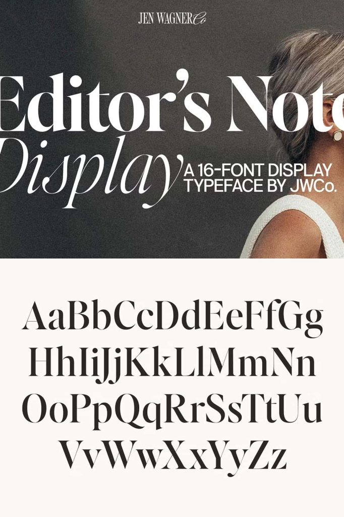
Precision Craftsmanship in Every Detail
Designers carefully refined every aspect of Editor’s Note Display to ensure visual perfection. The spacing between letters, the thickness of strokes, and the shape of each serif have all been meticulously adjusted to achieve optimal balance.
This obsessive attention to detail ensures that the font maintains its elegance across different layouts and sizes. Whether used in print publications or digital media, the typography remains sharp, balanced, and visually compelling.
Such precision allows designers to trust the font when creating high-end projects where typography plays a central role in the overall design.
Create Powerful Headlines with Editor’s Note Display
Editor’s Note Display provides designers with a powerful display serif that blends elegance with dramatic visual presence. Its razor-sharp points, high contrast strokes, and refined curves allow text to command attention while maintaining a sophisticated aesthetic.
For designers working on editorial layouts, branding projects, or high-end visual campaigns, this font delivers a perfect balance between beauty and impact. It transforms ordinary headlines into memorable typographic statements.
When you want typography that feels bold, elegant, and meticulously crafted, Editor’s Note Display stands out as an exceptional choice.