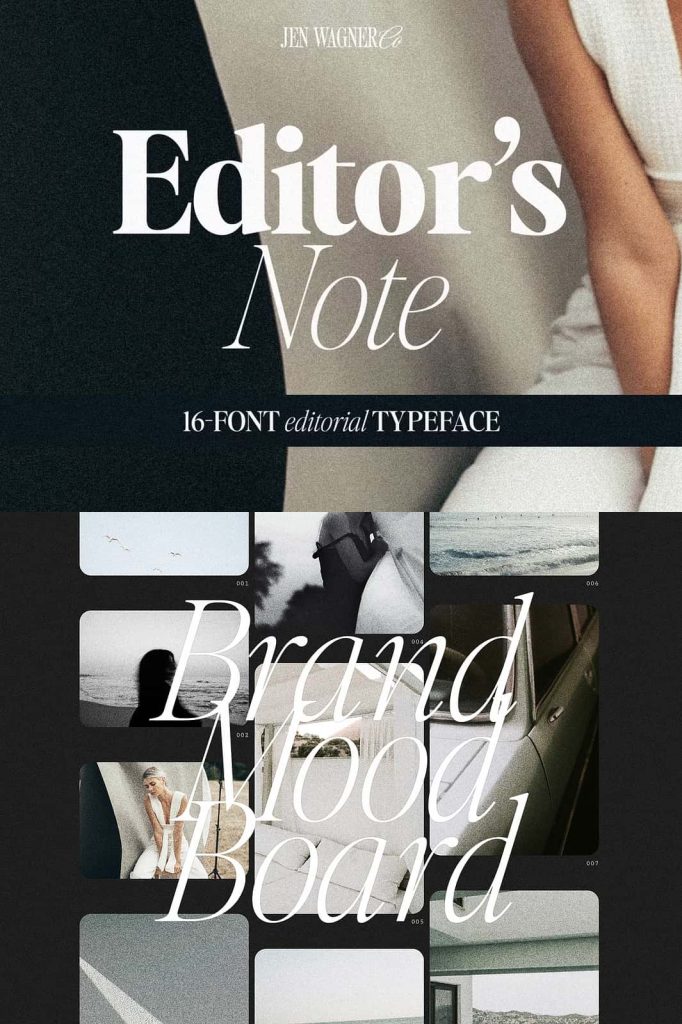
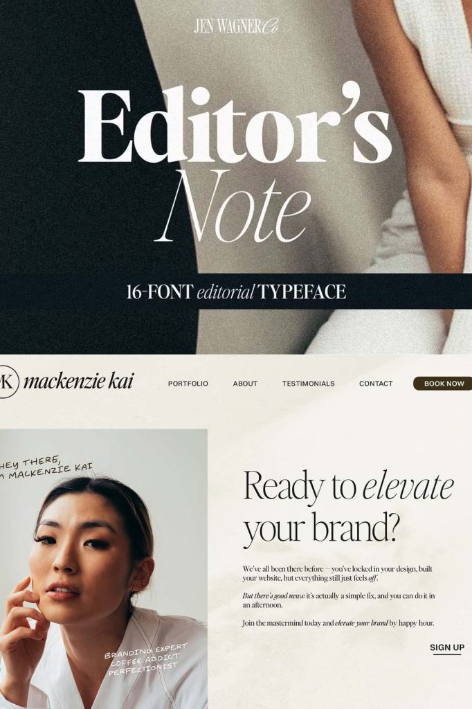
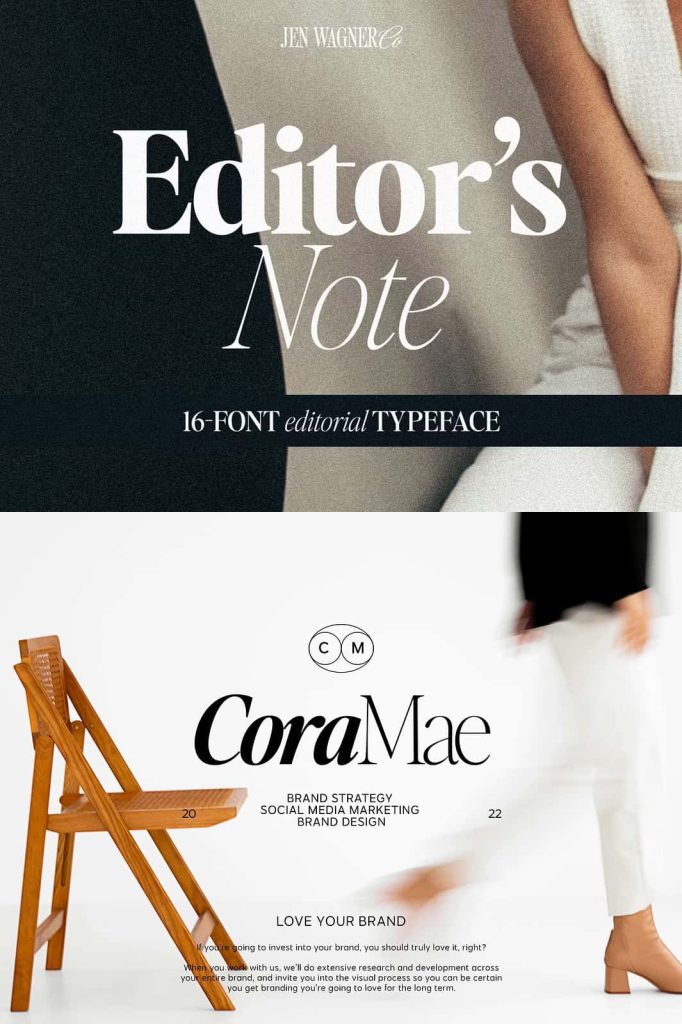
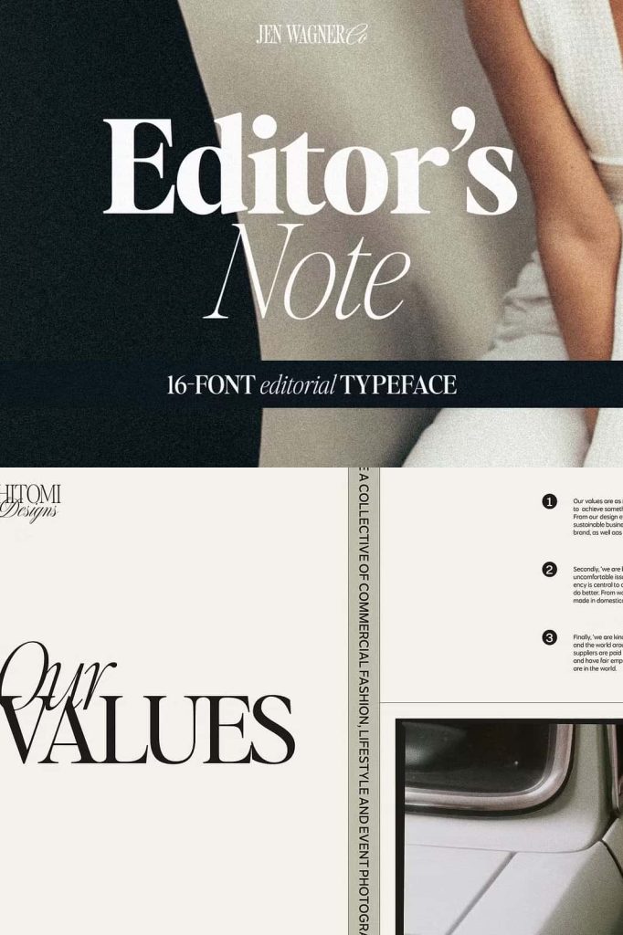
Editor’s Note Family – A Modern Editorial Font Family
Editor’s Note Family is a sophisticated editorial font family designed to deliver clean, modern, and professional typography. This typeface expands the original Editor’s Note design into a complete family that includes sixteen fonts, ranging from delicate Hairline weights to strong Bold styles. Each weight also includes a matching italic version, giving designers a powerful set of tools to build refined and versatile typography systems.
This editorial font family embraces the minimalist design movement that continues to influence modern branding, publishing, and digital design. With its crisp structure, tight curves, and balanced proportions, Editor’s Note Family creates a timeless typographic voice that works beautifully across a wide range of creative projects.
Designers who appreciate modern editorial aesthetics will find this font family both elegant and practical. It brings together clarity, style, and versatility, making it suitable for both print and digital layouts.
A Complete Font Family with 16 Styles
Editor’s Note Family offers a complete collection of sixteen carefully crafted fonts. Each weight maintains the same clean structure and editorial personality, allowing designers to create strong visual hierarchies while keeping a consistent typographic identity.
The font family includes both regular and italic styles across multiple weights, giving you flexibility when designing headlines, body text, captions, and supporting elements. The italics add subtle emphasis and elegance while preserving readability and harmony with the upright styles.
By providing a wide weight range, Editor’s Note Family allows designers to build layered layouts that feel structured and intentional. From thin and delicate Hairline styles to confident Bold weights, every variation maintains the same minimalist elegance.
Font Family Includes
- Hairline
- Hairline Italic
- Extra Light
- Extra Light Italic
- Light
- Light Italic
- Regular
- Regular Italic
- Medium
- Medium Italic
- Semi Bold
- Semi Bold Italic
- Bold
- Bold Italic
- Additional refined styles for balanced typography
- Total of 16 fonts in the family
Clean Editorial Style for Modern Design
Editor’s Note Family reflects the growing popularity of editorial typography in modern design. Editorial fonts emphasize clarity, elegance, and structure, making them ideal for projects that require both visual sophistication and readability.
The letterforms feature smooth strokes, tight curves, and carefully controlled spacing. These details allow the font to maintain excellent readability while still delivering a stylish visual presence. The minimalist construction ensures that text remains clear and refined across different sizes and formats.
Whether you design large editorial headlines or smaller paragraph text, this font family adapts easily while maintaining its modern character.
Perfect for Editorial, Branding, and Publishing
This editorial font family works exceptionally well in publishing environments such as magazines, books, and online articles. Its clean structure helps create professional page layouts that guide readers through content effortlessly.
Designers can also use Editor’s Note Family for branding projects that require a modern yet timeless identity. The minimalist style pairs well with contemporary logos, packaging designs, and corporate materials. Businesses looking for refined typography will appreciate the clarity and versatility of this typeface.
The font also performs beautifully in digital design. Websites, blogs, and social media graphics benefit from the crisp shapes and balanced spacing that improve readability on screens.
Minimalist Typography with Timeless Appeal
Minimalism continues to influence modern graphic design, and Editor’s Note Family captures that aesthetic perfectly. The typeface focuses on simplicity while preserving elegance and personality. By removing unnecessary decorative elements, the font emphasizes clarity and structure.
This approach allows the typography to support the design rather than overpower it. Designers can create layouts that feel calm, organized, and visually sophisticated.
Editorial typography never truly goes out of style. Clean, structured fonts remain a reliable choice for designers who want their work to feel both contemporary and timeless.
Create Strong Typography Systems
With sixteen fonts included in the family, Editor’s Note provides the flexibility needed to build professional typography systems. Designers can combine multiple weights and italics to create strong hierarchy across headings, subheadings, and body text.
Thin weights work beautifully for elegant titles and modern headlines, while medium and bold weights provide strong emphasis where needed. The italic styles add contrast and movement that help highlight quotes, captions, or special content.
Because every style shares the same design foundation, the entire font family works together seamlessly. This consistency allows designers to create layouts that feel polished and intentional.
A Reliable Typeface for Designers
Editor’s Note Family delivers everything designers expect from a professional editorial font family. It combines versatility, elegance, and modern minimalism in a single typographic system. The wide range of weights and italic styles provides flexibility for both large-scale layouts and detailed typography work.
If you enjoy the clean editorial type trend shaping modern design, this font family will quickly become an essential part of your toolkit. Its timeless structure ensures that your typography remains stylish and relevant across many different creative projects.