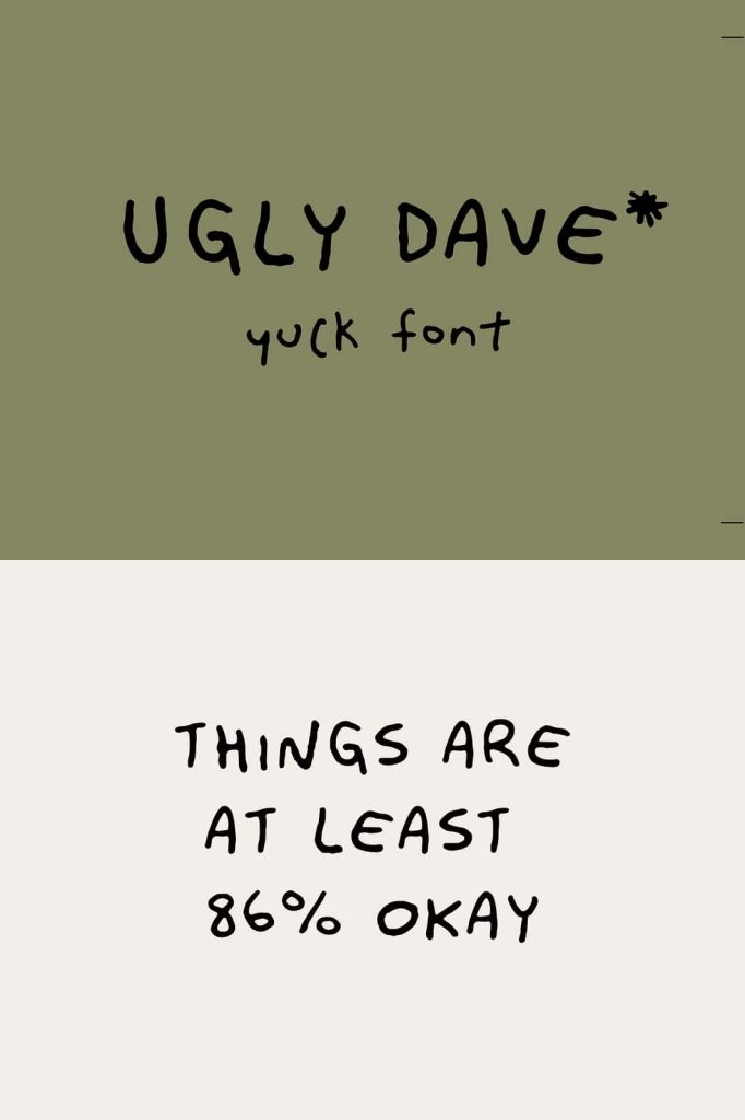
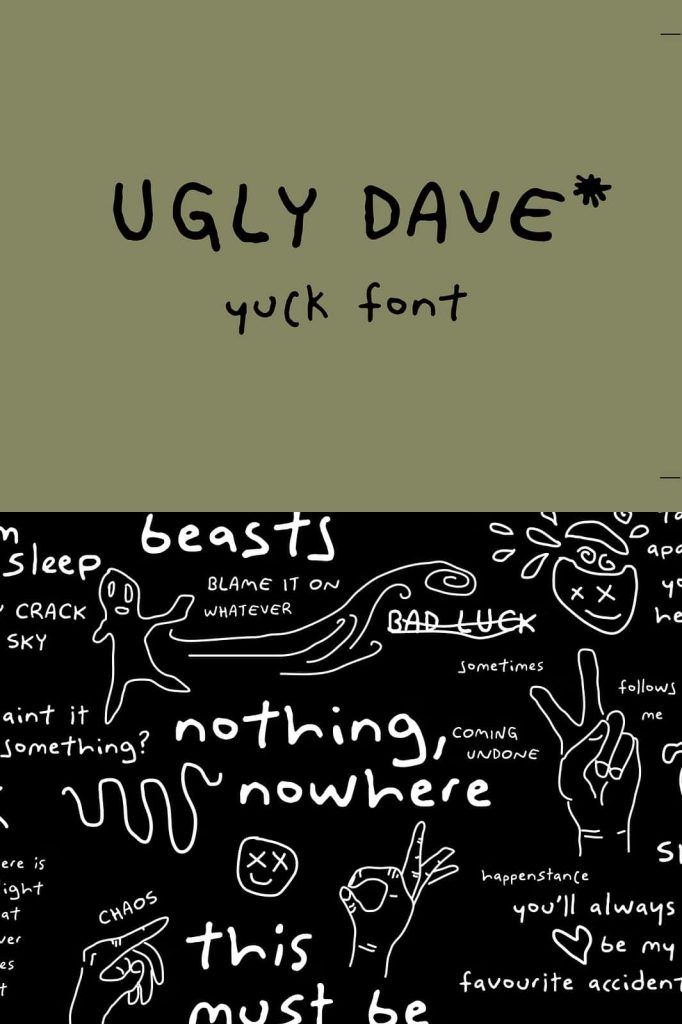
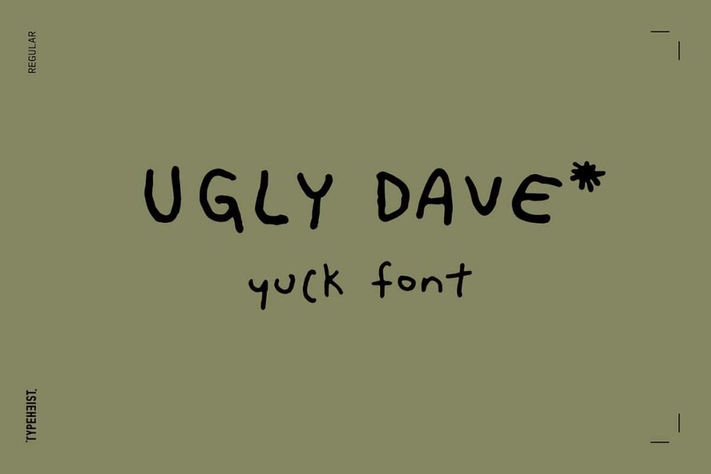
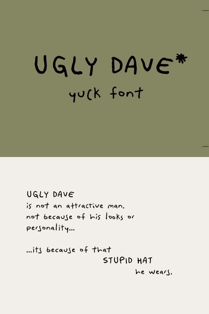
Ugly Dave Messy Handwritten Font
Ugly Dave is not your typical polished typeface. This intentionally messy handwritten font proudly rejects perfection and embraces raw, chaotic lettering. The design captures the look of careless handwriting that feels spontaneous, childish, and completely unrefined. While many fonts strive for elegant balance and precision, Ugly Dave takes the opposite direction and celebrates imperfection.
This font brings a playful and humorous tone to typography. Its uneven strokes, awkward letterforms, and intentionally clumsy appearance create a style that feels authentic, expressive, and surprisingly charming. Designers who want to break away from traditional typography will find Ugly Dave to be a refreshing and entertaining creative tool.
A Font That Proudly Rejects Perfection
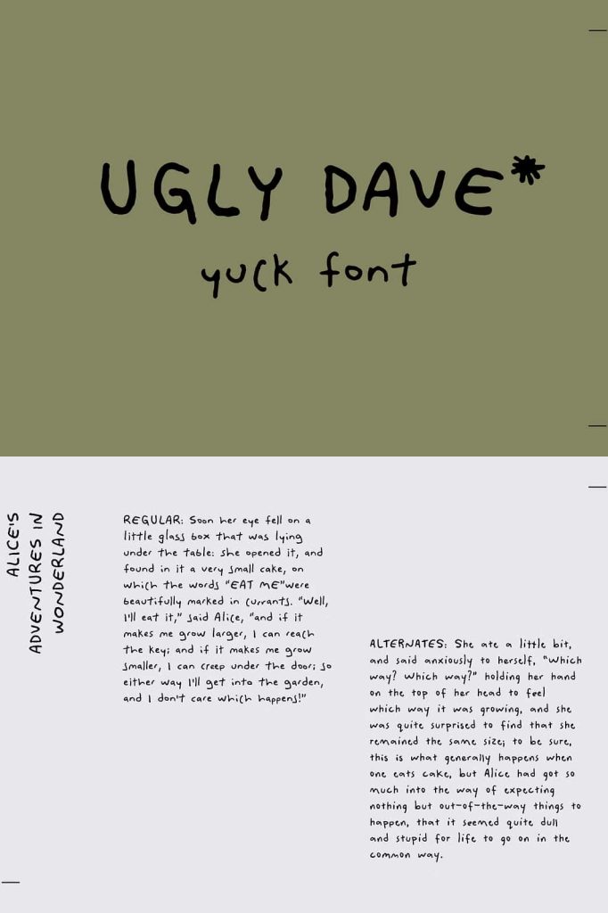
Ugly Dave does not attempt to look sophisticated or elegant. Instead, it proudly represents the most basic form of handwriting. The letters appear uneven, inconsistent, and sometimes awkward, just like the writing you might find in a hurried note or a scribbled doodle.
This design philosophy intentionally avoids the polished appearance found in most digital fonts. Rather than correcting irregular shapes, the typeface embraces them. Each letter displays exaggerated imperfections that make the font feel raw and unfiltered.
By rejecting perfection, Ugly Dave creates a typography style that feels refreshingly honest and full of personality.
Messy, Childish, and Unapologetically Rough
One of the defining characteristics of Ugly Dave is its messy and childish handwriting style. The strokes feel loose and unstructured, as if someone quickly scribbled the letters without worrying about alignment or neatness.
Some viewers might even describe the font as deliberately ugly or awkward. However, that is exactly what gives the typeface its unique appeal. The childish handwriting style adds humor and playfulness to designs, making the typography feel more expressive and less serious.
Instead of trying to impress with elegance, Ugly Dave focuses on creating personality and entertainment through imperfect lettering.
Consistently Imperfect Letterforms
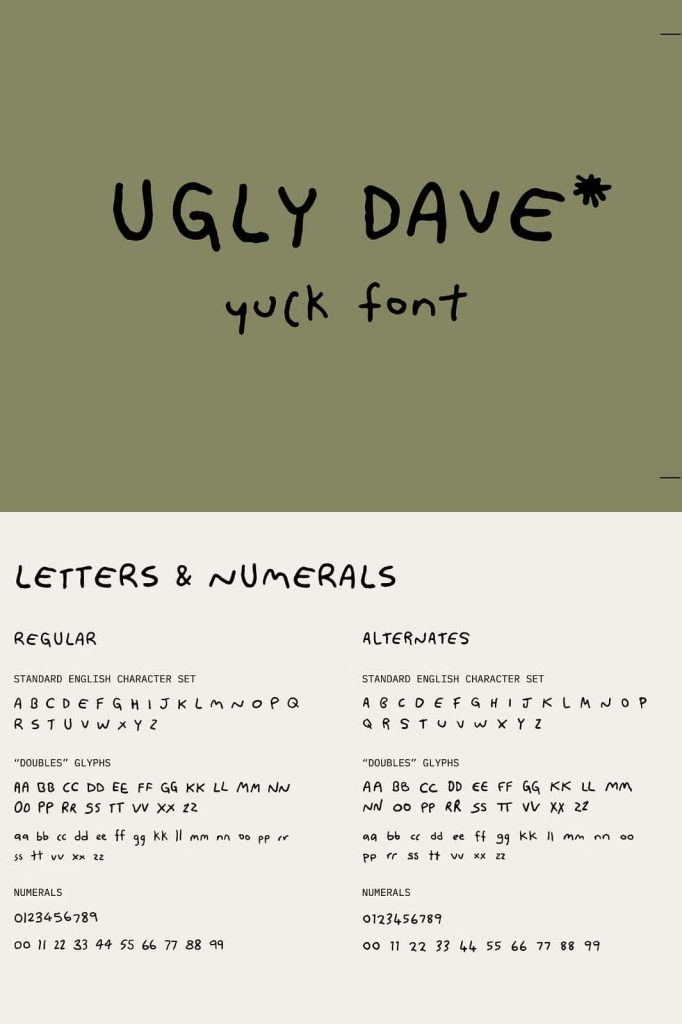
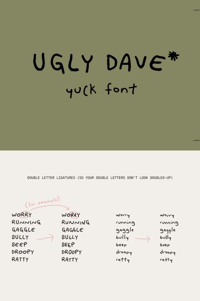
Although the font looks chaotic, the design still maintains a consistent style across all characters. Every letter follows the same messy handwriting logic, which ensures that text remains readable while still looking deliberately rough.
This consistency allows designers to use the font confidently in their projects. While the letters appear wild and irregular, they still work together as a cohesive typeface. The result is messy handwriting that feels intentional rather than random.
Ugly Dave proves that even bad handwriting can become a strong design element when applied consistently.
Almost Legible and Proud of It
Ugly Dave walks a fine line between readability and chaos. The letters remain recognizable enough to communicate words clearly, but they never look overly neat or structured. This balance gives the font its distinctive personality.
The slightly awkward shapes encourage viewers to pause and look more closely at the text. In many cases, this effect actually increases engagement because the typography feels unusual and memorable.
While the font may not aim for perfect readability, it successfully delivers a playful and humorous visual experience.
Perfect for Humorous and Casual Designs
Ugly Dave works especially well in design projects that benefit from humor and casual energy. Its rough handwriting style can immediately communicate playfulness and spontaneity, making it perfect for lighthearted content.
Designers often use fonts like Ugly Dave for comic graphics, funny posters, social media memes, and casual digital artwork. The childish lettering style adds personality and makes messages feel more entertaining.
Because the font looks intentionally messy, it helps designers create visuals that feel relaxed and informal.
Great for Comic and Cartoon Typography
The exaggerated handwriting style of Ugly Dave makes it an excellent choice for comic or cartoon-inspired typography. The letters feel expressive and animated, which fits naturally with illustrated storytelling and humorous design.
Designers can use the font for speech bubbles, comic titles, playful captions, and illustrated posters. The chaotic shapes add movement and personality to the text, making the typography feel alive within the design.
When combined with bright colors or hand-drawn illustrations, Ugly Dave can help create vibrant and entertaining compositions.
Useful for Creative and Experimental Projects
Ugly Dave also works well in experimental design projects where traditional typography might feel too rigid. The font encourages designers to explore unconventional layouts and playful visual storytelling.
Because the typeface intentionally ignores strict typographic rules, it gives designers more creative freedom. They can use it to challenge expectations and produce designs that feel unique and unpredictable.
This makes the font a valuable option for artists, illustrators, and designers who enjoy pushing creative boundaries.
A Typeface That Celebrates Imperfection
Ugly Dave ultimately proves that typography does not always need to be neat, elegant, or refined to be effective. By embracing messy handwriting and exaggerated imperfections, the font creates a style that feels authentic, humorous, and memorable.
Its childish character and awkward letterforms give designers a powerful tool for playful and unconventional design. Whether used in comic graphics, humorous posters, or casual digital artwork, Ugly Dave brings personality and spontaneity to any project.
For designers who want typography that breaks the rules and celebrates imperfection, Ugly Dave delivers a messy yet surprisingly effective solution.