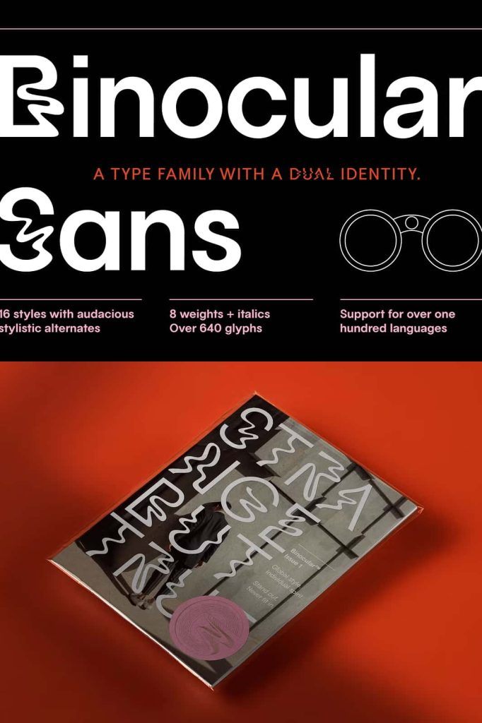
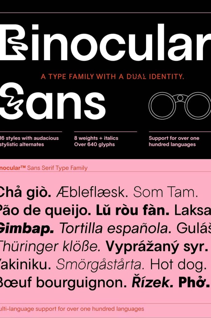
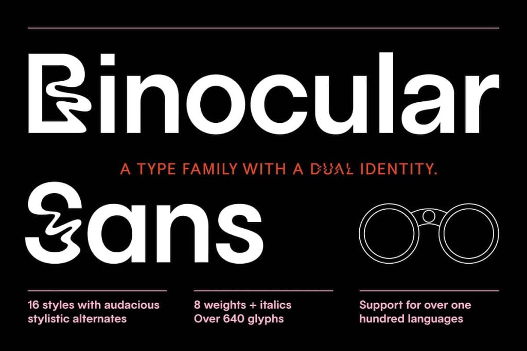
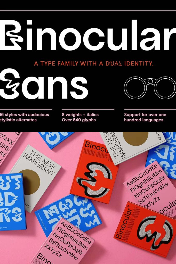
Binocular Sans Font Family
Binocular Sans is a modern sans serif type family that blends multiple typographic influences into one distinctive visual voice. Designers created this typeface to bridge the stylistic gap between modernist geometric sans serifs and classic neo-grotesque typography. The result is a balanced, flexible, and expressive font that works across many design environments.
With its refined proportions, clear structure, and subtle personality, Binocular Sans introduces a fresh perspective to contemporary typography. The typeface embraces hybrid design principles, combining technical precision with artistic individuality. This thoughtful approach allows the font to stand out while maintaining strong readability and visual harmony.
A Sans Serif Typeface with a Dual Identity
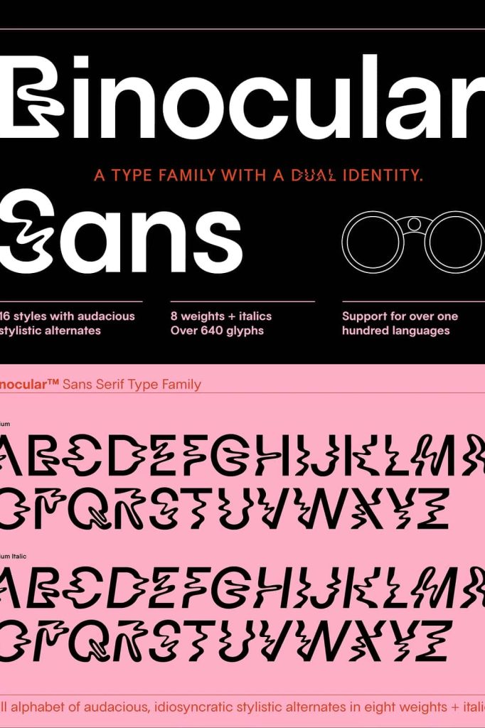
Binocular Sans stands out because of its dual typographic identity. It merges the rational geometry commonly found in modernist sans serif typefaces with the functional clarity of neo-grotesque designs. This combination creates a typeface that feels both structured and expressive.
Geometric influences contribute clean shapes, balanced letterforms, and consistent visual rhythm. At the same time, neo-grotesque elements introduce subtle irregularities and organic character that prevent the font from appearing overly mechanical. Designers intentionally used this contrast to craft a typeface that feels contemporary, adaptable, and visually engaging.
This hybrid typographic approach reflects modern design culture, where cross-influence and experimentation often lead to more meaningful creative results.
Inspired by Cultural Hybridization
The design philosophy behind Binocular Sans celebrates individuality and nonconformity. Rather than strictly following one historical typographic model, the typeface draws inspiration from multiple design traditions and blends them into a unified system.
This hybridization represents the evolving nature of design in a globally connected creative landscape. Cultural crossovers influence visual communication more than ever, and Binocular Sans captures that spirit by allowing subtle irregularities and unique details to coexist within a cohesive structure.
The result is a typeface that feels authentic and dynamic, offering designers a tool that supports both clarity and personality.
Designed for Versatility
One of the strongest advantages of Binocular Sans is its exceptional versatility. Designers can apply the font across a wide range of visual projects without sacrificing readability or aesthetic quality. Whether used in digital interfaces, printed materials, or brand identities, the typeface maintains consistent performance.
Its balanced proportions and well-crafted letterforms allow it to adapt easily to different typographic roles. This flexibility makes Binocular Sans suitable for creative professionals working in branding, editorial design, user interface design, and marketing materials.
The font performs equally well in large display sizes and smaller text settings, giving designers greater freedom when building visual hierarchies.
Perfect for Headlines and Display Typography
Binocular Sans works exceptionally well for eye-catching headlines and prominent display typography. The clean shapes and confident structure of the letterforms make titles appear strong, modern, and visually impactful.
Designers often use this typeface to create attention-grabbing headers in magazines, websites, advertisements, and posters. The distinctive personality of the font ensures that headlines remain memorable while maintaining clarity and balance.
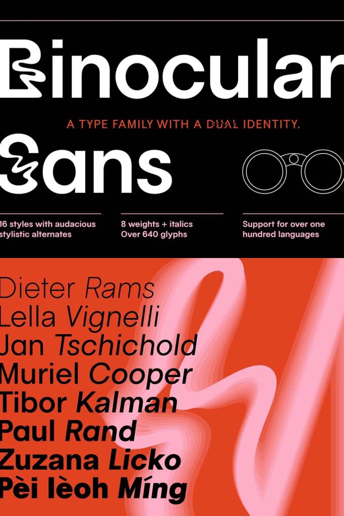
Ideal for Logotypes and Branding
Brand designers frequently choose Binocular Sans for logo design and visual identity systems. The font offers enough uniqueness to create recognizable brand marks while maintaining the professionalism required for corporate and commercial use.
Its refined curves, consistent spacing, and harmonious proportions make it easy to customize for logos and wordmarks. Brands that seek a contemporary yet timeless typographic style can benefit greatly from the character of Binocular Sans.
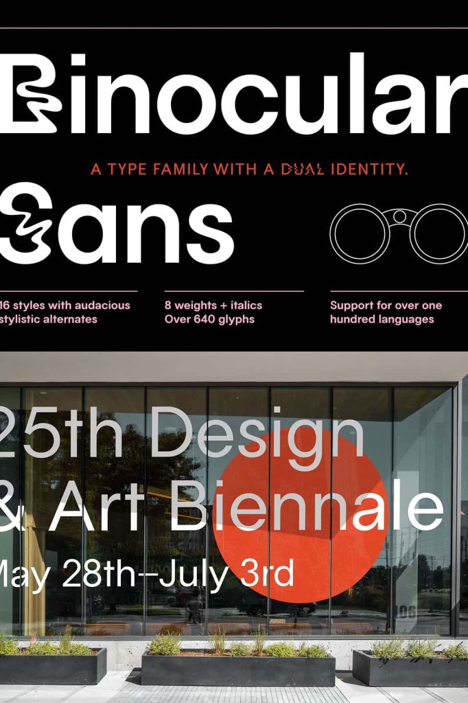
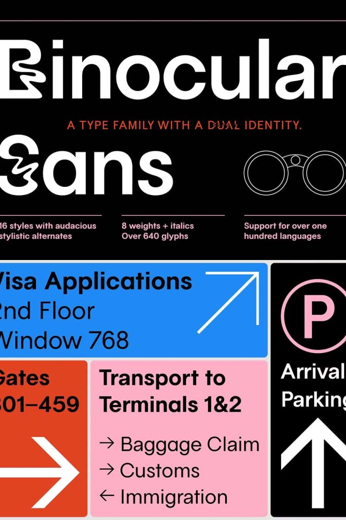
Clear and Readable for Wayfinding Systems
Wayfinding systems require typography that communicates information clearly and efficiently. Binocular Sans provides the clarity necessary for signage and navigational graphics. The clean shapes and open letterforms allow viewers to quickly recognize words from a distance.
Because of this reliability, designers can confidently use the font in public spaces, transportation systems, museums, office buildings, and large venues where readability plays a critical role.
Optimized for Subheaders and Long-Form Text
Another strength of Binocular Sans lies in its excellent readability. The typeface features a tall x-height and carefully optimized spacing, which improves legibility across multiple text sizes.
This design decision allows the font to perform well in subheaders, paragraphs, and extended reading environments. Even in longer blocks of text, the letterforms remain clear and comfortable for readers.
Designers working on editorial layouts, blog posts, reports, and digital content will appreciate the font’s ability to maintain visual consistency throughout a complete typographic system.
A Typeface that Celebrates Individuality
Binocular Sans ultimately serves as a tribute to creative independence in typography. It demonstrates how designers can challenge conventions while still respecting the functional foundations of type design.
By combining geometric precision with neo-grotesque practicality and subtle post-modern influence, the typeface encourages experimentation without sacrificing usability.
For designers seeking a contemporary sans serif with personality, flexibility, and excellent readability, Binocular Sans offers a compelling typographic solution.