Reost Modern Font Family: Stylish Geometric Typography for Contemporary Design
Reost Modern Font Family is a stylish and versatile typeface designed to support a wide range of creative and professional design projects. Built on a strong geometric foundation, this font family delivers clean shapes, balanced proportions, and a refined modern appearance that works beautifully across both print and digital layouts. Designers who want a flexible typeface capable of adapting to many different design environments will find Reost to be a powerful and reliable solution.
The font family combines modern elegance with playful character. While the geometric structure provides clarity and consistency, subtle design details give the typeface a unique personality. This balance allows Reost Modern Font Family to feel both professional and approachable, making it suitable for branding, editorial design, advertising, and digital media.
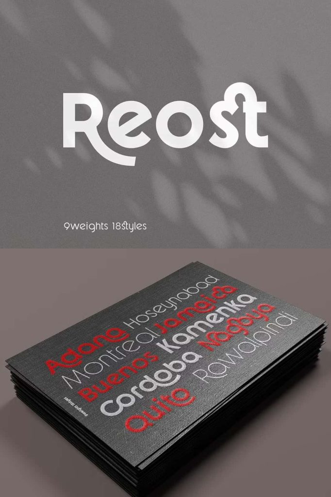
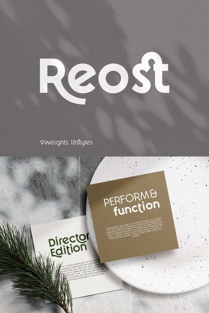
Reost also includes elegant ligatures that enhance the visual rhythm of typography. These features allow designers to create smooth letter connections and stylish text compositions that elevate the overall quality of their designs.
A Geometric Foundation for Balanced Typography
Reost Modern Font Family was carefully designed using a geometric system that ensures visual balance and consistency throughout every character. Geometric fonts rely on mathematical precision and structured proportions, which help maintain harmony across different letters and words. This approach makes the typeface highly adaptable to a variety of layouts and design styles.
The geometric construction ensures that characters align perfectly within text blocks and headings. Designers can confidently use the font in structured layouts such as magazine spreads, website interfaces, and corporate branding systems. Because the letterforms follow consistent geometric principles, text remains visually organized and easy to read.
This foundation also helps Reost perform well in both large display typography and smaller body text. The clean shapes maintain clarity across different sizes, allowing designers to create cohesive typography systems within a single project.
Designed to Adapt to Any Layout
Flexibility is one of the most important qualities in a modern font family. Reost Modern Font Family was created with adaptability in mind, allowing designers to use it across various layouts and visual environments. Whether the project involves print materials, digital interfaces, or branding systems, this typeface fits naturally into different design structures.
Because the font maintains balanced proportions and consistent spacing, it integrates easily into both minimalist and complex layouts. Designers can use Reost for headlines, subheadings, body text, and graphic elements without worrying about visual imbalance.
This adaptability makes the font ideal for creative professionals who work on multiple types of projects. Instead of switching between many typefaces, designers can rely on Reost to handle diverse typography needs with elegance and efficiency.
Carefully Controlled Interpolation for Consistent Quality
One of the technical strengths of Reost Modern Font Family lies in its carefully managed interpolation system. Interpolation refers to how letterforms transform between different weights or styles within a font family. Poor interpolation can create unwanted distortion or inconsistent contrast between characters.
In the design of Reost, special attention was given to ensure that interpolation deformation does not produce contrast distortion. This careful approach preserves the integrity of the letterforms across different weights and styles. As a result, every variation within the font family maintains the same visual harmony and structural quality.
This level of precision allows designers to confidently mix different weights within a layout while maintaining a cohesive and professional appearance.
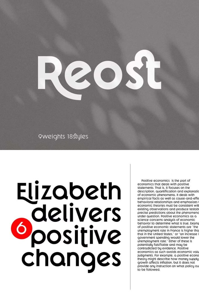
Elegant Ligatures for Smooth Typography
Reost Modern Font Family includes elegant ligatures that enhance the natural flow of text. Ligatures replace specific letter combinations with specially designed characters that connect more smoothly. These typographic features help eliminate awkward spacing and improve the overall rhythm of the text.
When used in headlines, branding, or editorial layouts, ligatures add subtle sophistication to typography. Designers can activate these features in professional design software to create more polished and visually engaging text compositions.
The ligatures also add a creative dimension to the font family. By introducing refined connections between letters, they help transform ordinary text into distinctive typography that feels stylish and thoughtfully crafted.
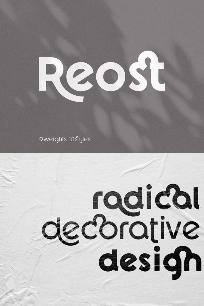
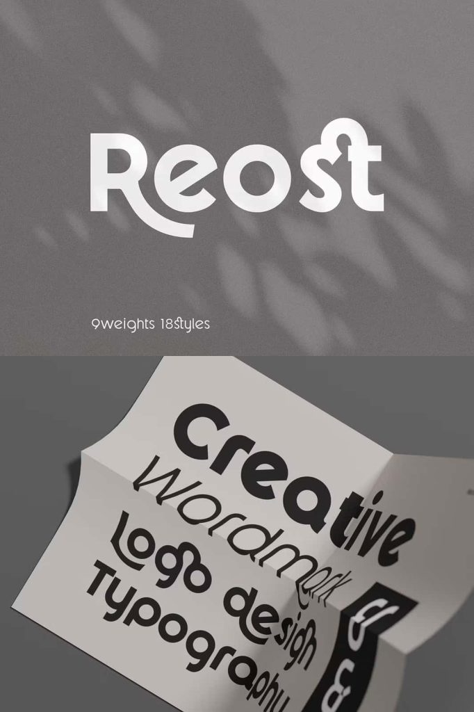
A Balance of Cute Personality and Professional Structure
Reost Modern Font Family carries a unique personality that combines subtle charm with disciplined structure. The geometric framework gives the typeface a clean and organized appearance, while the rounded shapes and thoughtful details add a touch of friendliness.
This combination creates a font that feels modern and elegant without appearing cold or overly technical. Designers can use Reost to communicate professionalism while still maintaining an approachable and creative tone.
Because of this balanced personality, the font works well in both corporate and creative environments. Businesses can use it for professional branding, while designers can apply it to artistic projects that require a playful yet refined aesthetic.
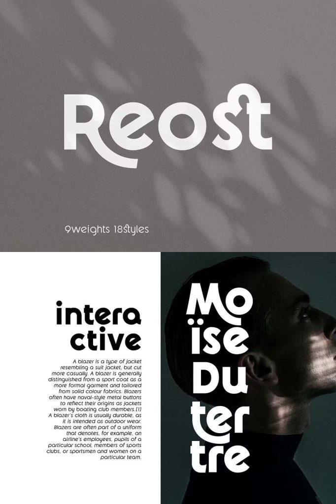
Perfect for Branding, Editorial, and Digital Design
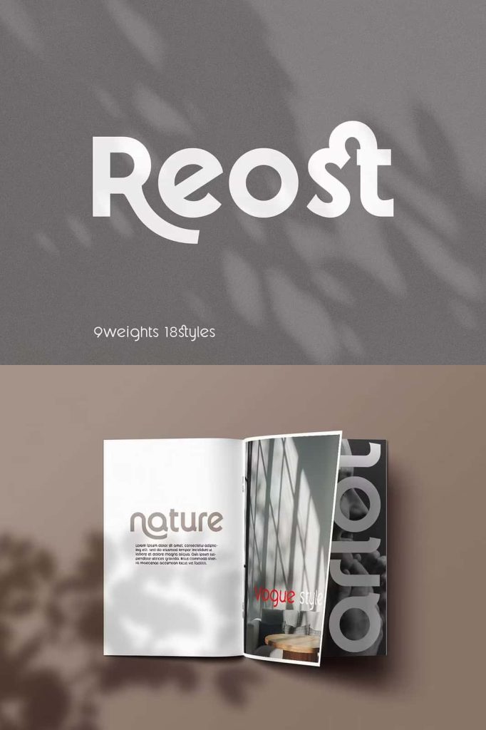
Reost Modern Font Family adapts effortlessly to a wide range of design applications. In branding projects, the clean geometric structure helps logos appear modern, balanced, and memorable. Companies that want to present a fresh and contemporary image can benefit from the clarity of this typeface.
Editorial designers also appreciate the readability and consistency of Reost. The font performs well in magazines, brochures, and digital publications where typographic hierarchy and layout precision are essential.
In digital design, the font integrates smoothly into website interfaces, mobile applications, and online marketing materials. Its clean shapes maintain clarity on screens, making it ideal for headings, navigation text, and promotional graphics.
Create Modern and Enjoyable Design Experiences with Reost
Reost Modern Font Family was created to make design work both effective and enjoyable. The combination of geometric precision, flexible layout compatibility, and elegant ligatures gives designers the tools needed to produce professional typography with ease.
Its versatile design ensures that it can support a wide range of creative projects while maintaining consistent quality and visual harmony. Designers can confidently use Reost across branding systems, editorial layouts, digital platforms, and marketing campaigns.
If you are searching for a modern font family that balances structure, creativity, and adaptability, Reost Modern Font Family offers an excellent solution. With its geometric foundation and elegant typographic features, it helps transform everyday text into polished and visually engaging design.