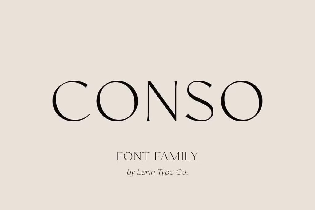
CONSO Sans Serif Font Family: Elegant Modern Typography for Professional Design
CONSO Sans Serif Font Family is a refined and modern typeface designed to deliver elegance, clarity, and strong visual impact in contemporary design projects. This font family blends clean geometric structure with noticeable contrast, creating a sophisticated sans-serif style that stands out while remaining highly readable. Designers who need a versatile and professional typography solution can rely on CONSO to support a wide range of creative applications.
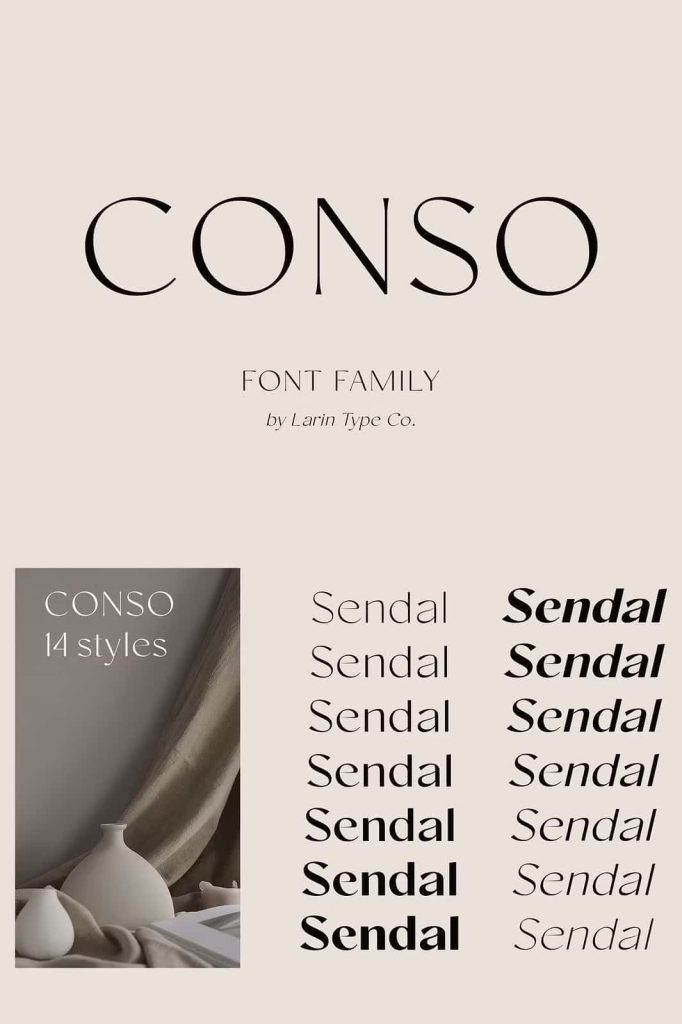
Built with both upright and italic styles, CONSO offers flexibility that allows designers to build dynamic layouts and balanced typography systems. Each style includes seven carefully crafted weights, ranging from thin to bold. This complete weight range gives designers precise control over hierarchy, emphasis, and visual rhythm within a design.
Whether you are creating logos, advertising campaigns, product packaging, book covers, editorial layouts, or website headers, CONSO Sans Serif Font Family provides the structure and elegance needed for modern typography.
A Modern Contrast Sans Serif with Distinctive Character
CONSO stands out because it combines the clarity of a sans-serif typeface with the sophistication of contrast-driven letterforms. The subtle variation between thick and thin strokes adds visual interest while maintaining a clean and contemporary appearance. This balance makes the font feel elegant without becoming overly decorative.
Designers often look for fonts that offer personality while still remaining versatile enough for different projects. CONSO meets that need by delivering strong typographic presence without sacrificing readability. Its modern structure allows it to perform well in both minimal design environments and complex layouts.
The font works beautifully in high-end branding, editorial design, and advertising campaigns where visual refinement matters. At the same time, its readability makes it equally effective for body text, descriptions, and informational content.
Complete Font Family with Seven Weights
CONSO Sans Serif Font Family includes seven distinct weights that help designers create clear typographic hierarchy. These weights range from thin to bold, allowing designers to emphasize key information and maintain visual balance throughout a layout.
Thin and light weights provide a clean and minimal aesthetic that works well for elegant headlines, fashion branding, and modern website layouts. Regular and medium weights offer excellent readability for longer text blocks, descriptions, and editorial content. Bold weights add strong visual impact that works perfectly for titles, advertising slogans, and brand messaging.
This wide range of weights allows designers to maintain consistency across multiple design elements while still creating contrast and structure within their typography system.
Upright and Italic Styles for Flexible Design
CONSO also includes both upright and italic styles for every weight. These italic versions add expressive movement and visual variation without disrupting the overall design structure. Designers can use italic styles to highlight quotes, emphasize key phrases, or create contrast within headings and subheadings.
The italic characters maintain the same elegant structure as the upright version while introducing a subtle dynamic flow. This makes them particularly useful in editorial design, magazine layouts, and promotional materials where visual rhythm plays an important role.
By combining upright and italic styles with multiple weights, designers can build flexible and professional typographic compositions.
Perfect for Branding and Visual Identity
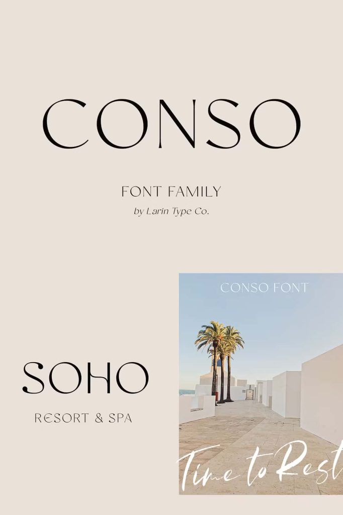
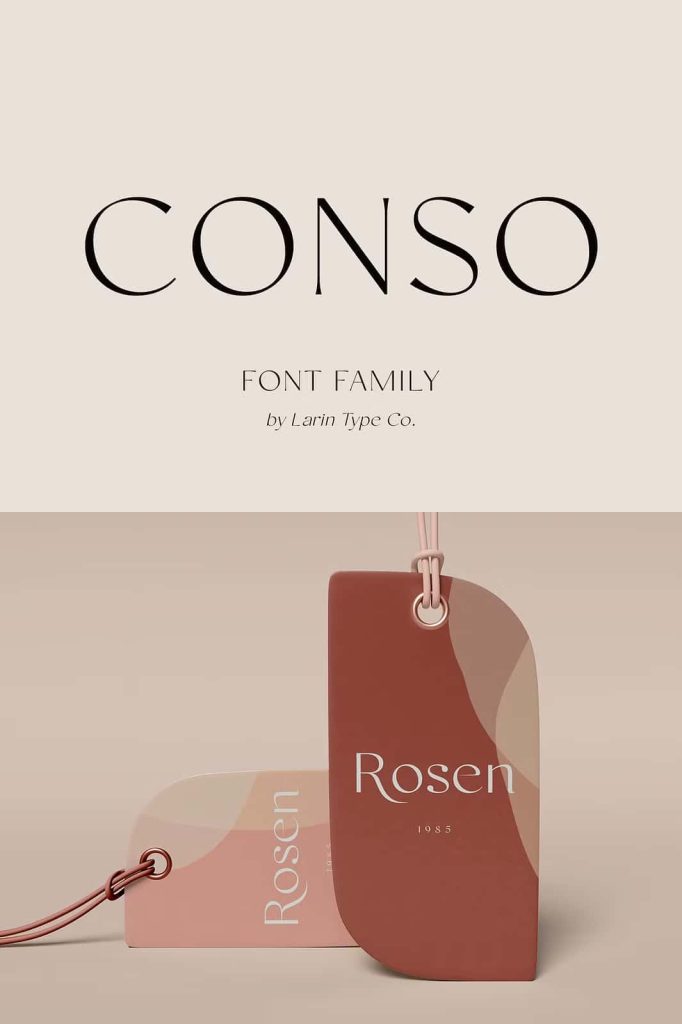
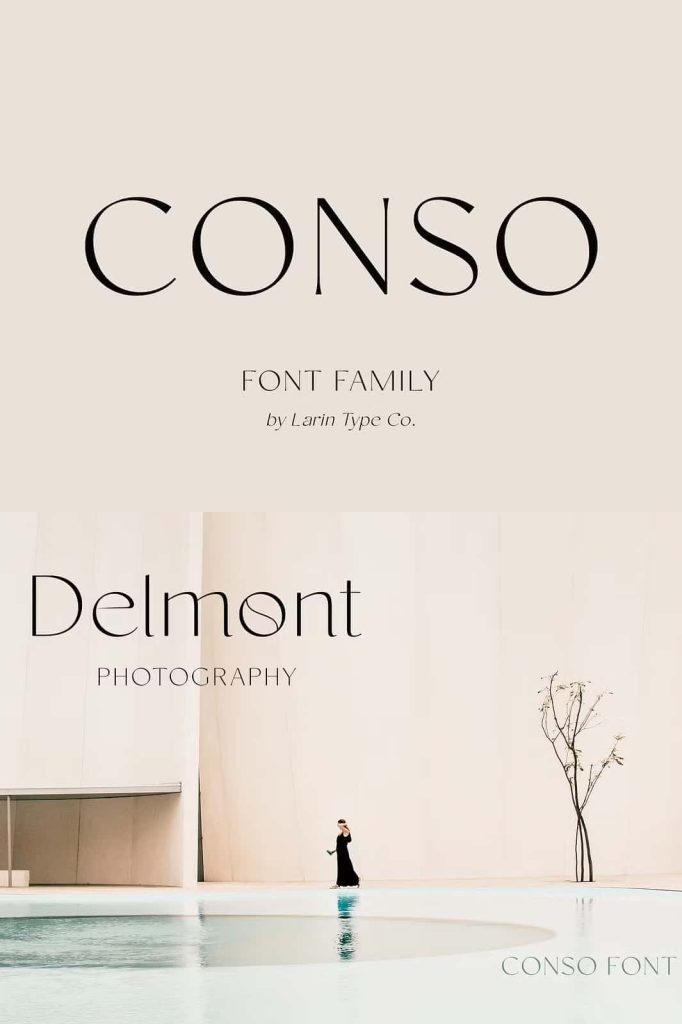
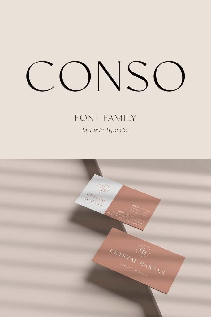
One of the strongest advantages of CONSO Sans Serif Font Family is its ability to support brand identity design. The clean structure and modern contrast help logos appear refined, confident, and memorable. Brands that want to communicate professionalism, innovation, or luxury can benefit from the distinctive appearance of this font.
Designers frequently use CONSO for logo design, corporate identity systems, and brand guidelines because the font adapts easily to different visual environments. It pairs well with both serif fonts and script fonts, allowing designers to build layered typography systems that feel balanced and cohesive.
When used in branding, the thin and light weights create elegance, while bold weights add authority and visibility. This flexibility makes CONSO an excellent choice for both minimalist and expressive brand styles.
Highly Effective for Advertising and Marketing
CONSO performs exceptionally well in advertising and marketing design. Its modern structure allows headlines to capture attention while maintaining readability in both print and digital formats. Advertisements often require typography that stands out quickly while delivering clear messaging, and CONSO provides that balance.
Designers can use the bold weights for impactful headlines and promotional banners while relying on regular weights for supporting descriptions and detailed information. This typographic contrast improves communication and ensures that important messages remain easy to read.
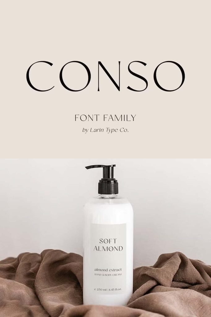
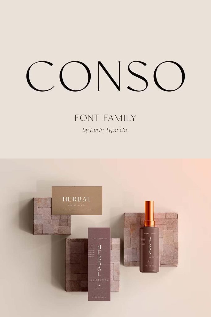
The font also works beautifully in packaging design, where clarity and visual appeal must work together to attract consumers. Its refined appearance helps products feel modern, premium, and professionally presented.
Ideal for Editorial Design and Publishing
CONSO Sans Serif Font Family also excels in editorial environments such as magazines, books, and digital publications. The balanced letterforms maintain readability across long paragraphs, while the contrast adds visual elegance to titles and section headers.
Magazine designers often need fonts that can handle multiple typographic roles within a single layout. CONSO allows designers to use different weights for headlines, subheadings, captions, and body text while maintaining a consistent visual style.
Book covers also benefit from the strong visual identity of this font. Its modern contrast and clean structure help titles appear clear and striking, making them more noticeable on both physical shelves and digital marketplaces.
Create Modern and Versatile Designs with CONSO
CONSO Sans Serif Font Family provides a powerful combination of elegance, readability, and versatility. The inclusion of seven weights along with upright and italic styles gives designers the tools they need to create structured and visually compelling typography.
From branding and advertising to packaging, editorial layouts, and digital design, CONSO adapts easily to different creative environments. Its modern contrast and clean letterforms allow designers to communicate ideas clearly while maintaining a sophisticated visual identity.
If you are looking for a professional sans-serif font family that offers flexibility, clarity, and modern elegance, CONSO is an excellent choice. With its balanced design and complete typographic system, this font family helps transform ordinary text into impactful visual communication.