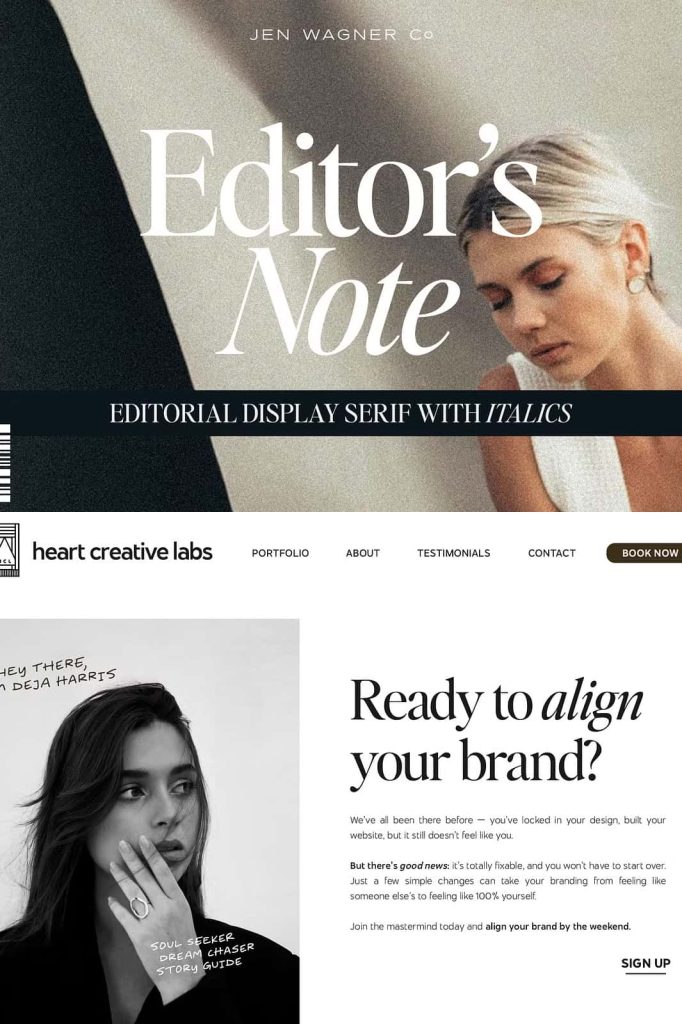
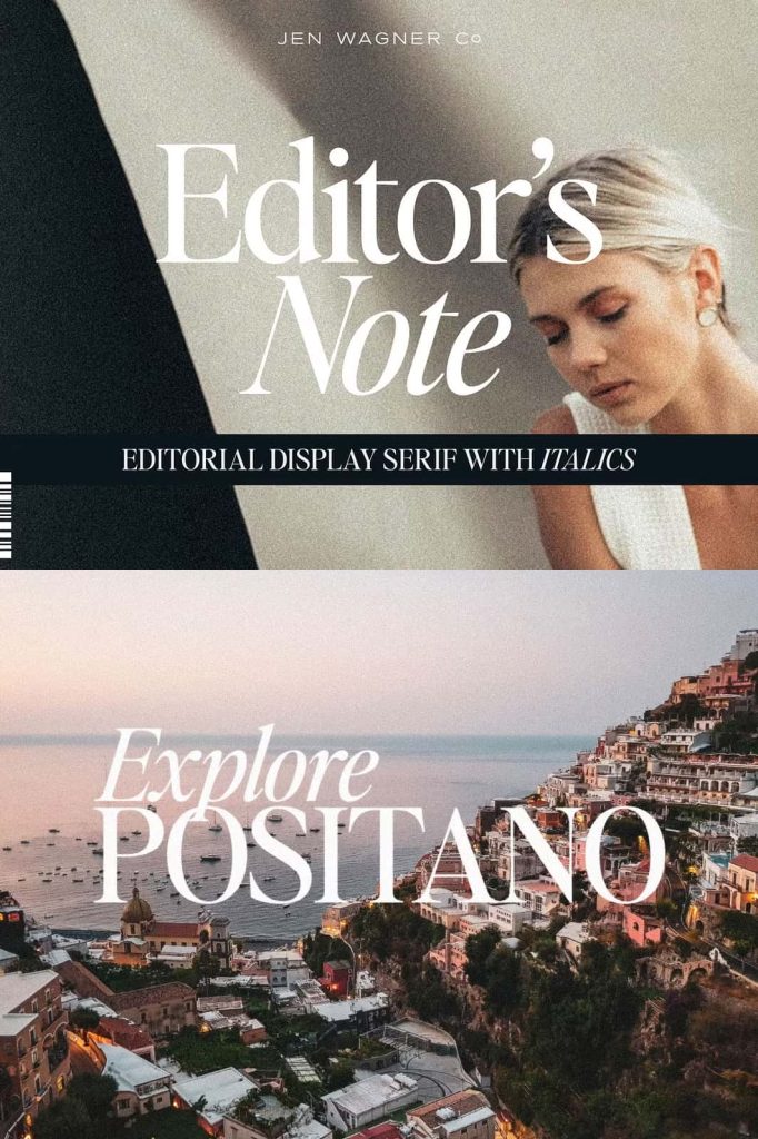
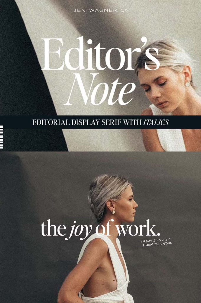
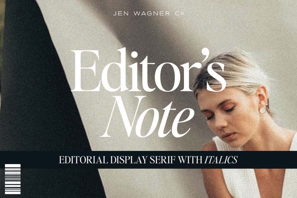
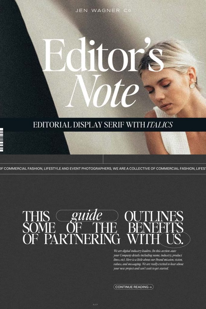
Editor’s Note – Modern Editorial Serif Font
Editor’s Note is a refined editorial serif font designed to bring elegance, clarity, and modern style into contemporary design projects. With its clean lines, balanced proportions, and beautifully crafted curves, this typeface captures the essence of modern editorial typography. Designers who want to create stylish layouts, polished branding, or sophisticated visual identities will find Editor’s Note to be a powerful and versatile typographic tool.
This font reflects the modern design movement that values simplicity, structure, and elegance. The combination of sharp details and smooth curves creates a strong visual presence while maintaining excellent readability. Editor’s Note allows designers to build compositions that feel confident, professional, and visually engaging without overwhelming the overall layout.
A Serif Typeface Inspired by Modern Editorial Design
Editorial typography plays a crucial role in shaping the visual identity of magazines, digital publications, and high-end branding. Editor’s Note draws inspiration from contemporary editorial design, where typography carries both functional and aesthetic importance. The font emphasizes clarity and precision while maintaining the graceful personality that defines classic serif typography.
Each character in Editor’s Note has been carefully designed to support clean and organized layouts. The tight curves and precise serif details create rhythm and balance across words and paragraphs. This thoughtful design ensures that the typeface performs well in both display settings and refined text layouts.
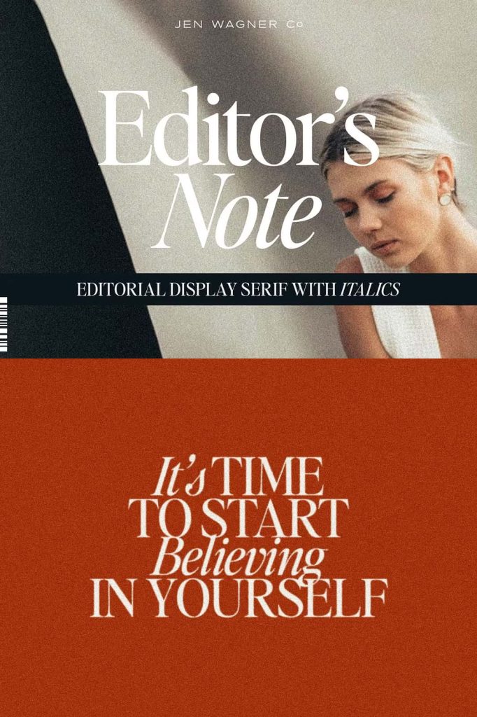
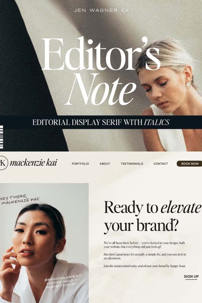
Whether you are working on magazine spreads, fashion editorials, digital blogs, or luxury branding materials, Editor’s Note offers the typographic sophistication needed to elevate your design.
Clean Lines and Tight Curves for a Contemporary Look
One of the defining features of Editor’s Note is its combination of clean structural lines and elegant curved details. These elements work together to produce a modern serif font that feels both timeless and fresh. The letterforms maintain strong readability while expressing subtle personality through their refined shapes.
The tight curves add character without becoming decorative or distracting. Instead, they create a polished visual texture that enhances headlines, titles, and key typographic elements within a layout. Designers can rely on Editor’s Note to maintain clarity even in complex editorial compositions.
The careful spacing and balanced proportions allow the typeface to adapt smoothly across different design environments. From print publications to digital interfaces, the font maintains consistency and visual harmony.
Minimalist Typography with Elegant Personality
Modern design trends increasingly embrace minimalism, where every element must serve a clear purpose. Editor’s Note aligns perfectly with this philosophy. The font communicates sophistication through simplicity, allowing designers to create impactful designs using restrained visual elements.
The minimalist character of the typeface makes it ideal for clean layouts that emphasize typography as the central design feature. Designers can use Editor’s Note to create elegant compositions that rely on strong typographic hierarchy instead of excessive decoration.
This approach works especially well for modern magazines, luxury brands, and high-end creative projects where clarity and refinement play a crucial role.
Perfect for Editorial and Branding Projects
Editor’s Note adapts beautifully to a wide variety of professional design applications. Its editorial roots make it particularly effective for projects that require refined typography and structured layouts.
Magazine and Editorial Layouts
The font excels in magazine spreads, feature articles, and editorial headlines. Its elegant serif structure enhances readability while maintaining visual sophistication across pages.
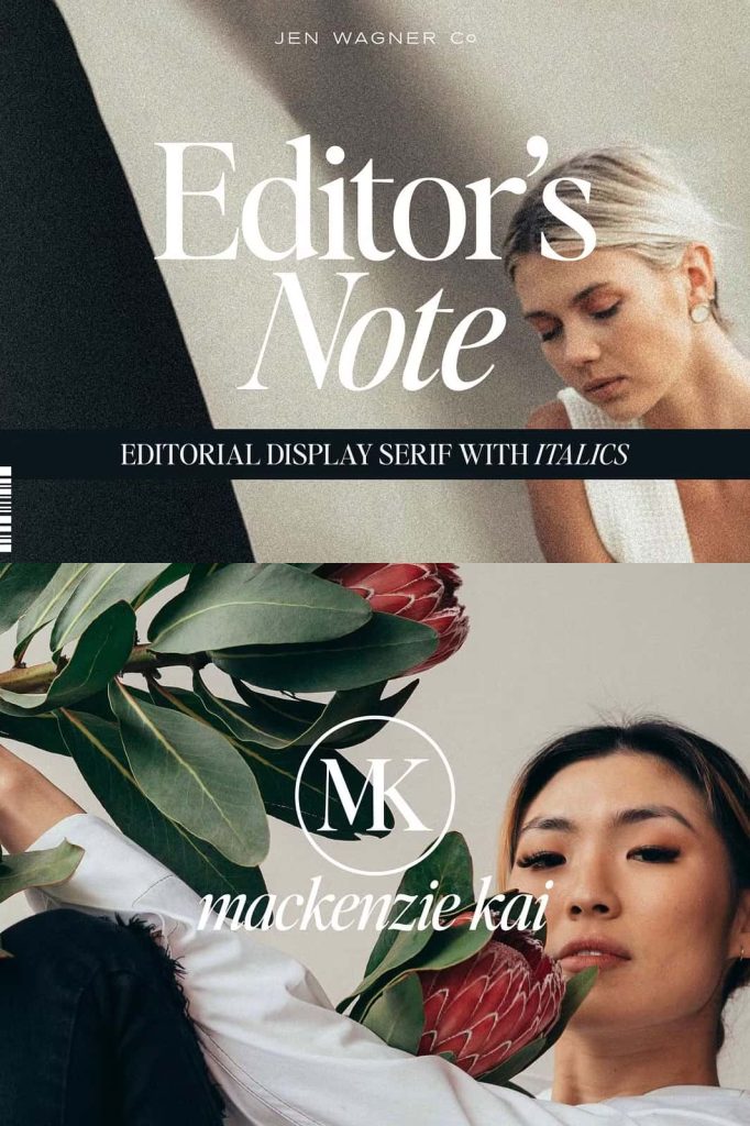
Brand Identity and Logo Design
Luxury brands, fashion labels, and creative studios often rely on serif typography to communicate trust and elegance. Editor’s Note provides the perfect foundation for refined logo designs and brand identity systems.
Website Typography and Blogs
Digital publications and lifestyle blogs can use Editor’s Note to create modern editorial aesthetics. The font delivers strong typographic hierarchy that helps guide readers through online content.
Advertising and Marketing Materials
Promotional campaigns, brochures, and marketing layouts benefit from the font’s clean structure and stylish appearance. Editor’s Note helps designers communicate messages clearly while maintaining a premium visual tone.
Typography That Elevates Visual Storytelling
Great typography does more than display words; it shapes the way audiences experience information. Editor’s Note allows designers to craft compelling visual narratives by using typography as a central design element. The elegant serif details add character, while the minimalist structure keeps the focus on the message.
By adjusting size, spacing, and layout, designers can create a wide range of visual moods using the same typeface. Large editorial headlines feel bold and confident, while smaller text sections maintain clarity and sophistication.
This flexibility makes Editor’s Note an essential typeface for designers who want a consistent yet expressive typographic voice.
A Typeface Built for Modern Designers
Today’s designers require fonts that combine aesthetic quality with functional reliability. Editor’s Note delivers both. Its editorial inspiration, minimalist design language, and carefully crafted letterforms make it a dependable choice for a wide range of creative projects.
The font empowers designers to produce layouts that feel organized, stylish, and contemporary. It supports strong typographic hierarchy while maintaining visual elegance across every element of the design.
By incorporating Editor’s Note into your creative workflow, you gain access to a modern editorial serif font that elevates headlines, strengthens branding, and enhances the overall quality of your typography-driven projects.